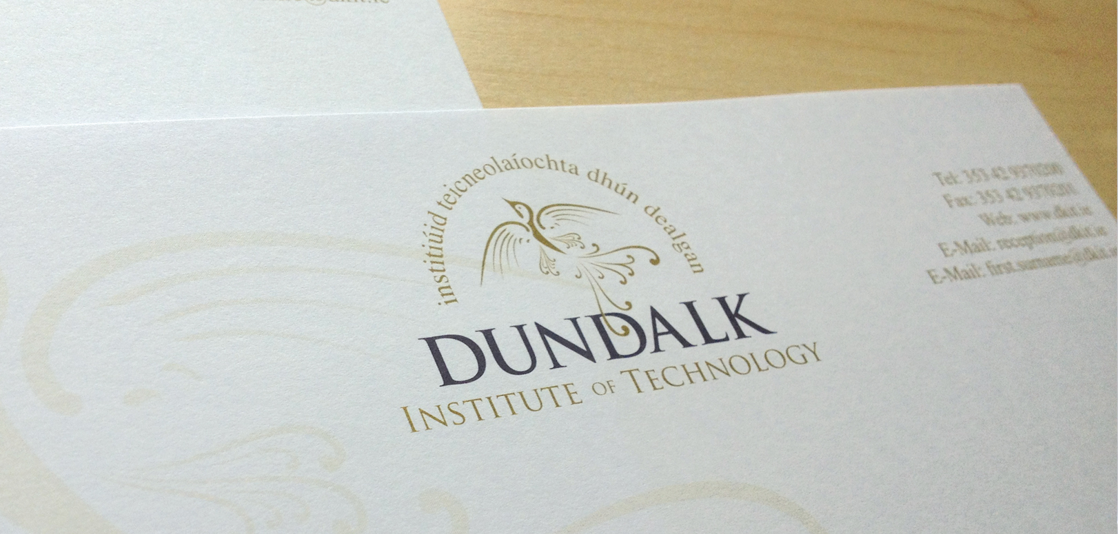
My Designs solution for Dundalk Institute of Technology’s new identity was based on a re-imagining of the long forgotten martlet emblem, the mythical bird which features in Dundalk’s town crest. I was familiar with the three birds my whole life, but after a little research I knew it was the perfect icon. The martlet has tufts of feathers instead of legs and therefore it cannot land, so its constant flight is viewed as a metaphor for an unending quest for knowledge and learning.
The martlet has an equally appropriate meaning in heraldry, where it often appears as the cadency mark of the fourth son. Traditionally, the fourth son was educated but received no part of the family wealth and had to make his own fortune, thus the martlet became a symbol of hard work, ingenuity and perseverance. Inclusiveness is an important aim of DkIT as they believe in learning for all, not just for the privileged or the few.
The martlet icon has been associated with Dundalk and with the North East since the 1300s when Thomas de Furnival acquired the lands where much of the town now stands. It is appropriate that this ancient emblem of Dundalk is renewed and updated to reflect today’s progressive, inclusive and dynamic culture at Dundalk Institute of Technology.